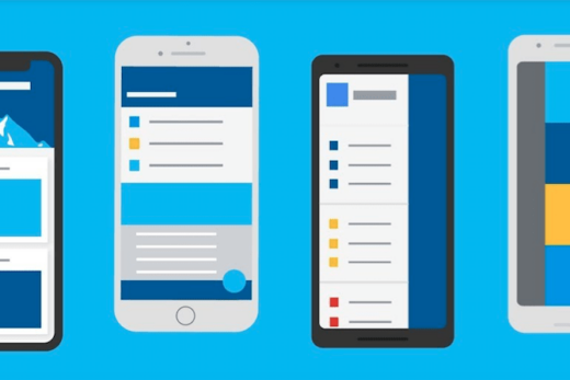
Flutter Sizer is a package that helps you to create responsive UI layouts in Flutter applications. It allows you to scale your app’s font size, padding, margin, and other UI elements based on the screen size and density of the device.
To use Flutter Sizer in your project, you’ll first need to add it to your pubspec.yaml file:
dependencies:
  flutter_sizer: ^2.0.0
Once you’ve added the package to your project, you can use the SizerUtil class to set up your app’s sizing system. Here’s an example of how you might use SizerUtil in your app’s main() function:
import 'package:flutter_sizer/flutter_sizer.dart';

void main() {
  WidgetsFlutterBinding.ensureInitialized();
  SizerUtil().init(); // Initializes the SizerUtil
  runApp(MyApp());
}
After initializing SizerUtil, you can use its sizer property to set up your app’s sizing. Here’s an example of how you might use sizer to create a responsive font size:
import 'package:flutter/material.dart';
import 'package:flutter_sizer/flutter_sizer.dart';

class MyTextWidget extends StatelessWidget {
  final String text;

  const MyTextWidget({Key? key, required this.text}) : super(key: key);

  @override
  Widget build(BuildContext context) {
    return Text(
      text,
      style: TextStyle(
        fontSize: 20.sp, // 20 scaled points
      ),
    );
  }
}
In this example, 20.sp sets the font size to 20 scaled points. Scaled points are a unit of measurement that scales with the screen size and density, so the font size will adjust automatically on different devices.
Flutter Sizer also provides other useful utilities, such as height, width, and fontSizer. These utilities allow you to specify sizes and font sizes relative to the screen size, which can be useful for creating responsive layouts.
Overall, Flutter Sizer is a powerful package that can help you create responsive UI layouts in your Flutter applications. By using SizerUtil and other utilities provided by the package, you can create UIs that look great on a wide range of devices.
Usage examples
Flutter Sizer provides several other useful features that can help you create responsive UI layouts. Here are a few examples:
The SizerConfig class
This class allows you to configure the scaling behavior of Flutter Sizer. You can use it to set the base font size, the minimum and maximum font sizes, and other parameters. Here’s an example of how you might use SizerConfig:
SizerUtil().init(
  config: SizerConfig(
    fontSize: 18,
    textScaleFactor: 1.2,
    lineScaleFactor: 1.2,
  ),
);
In this example, we’re setting the base font size to 18 points and the text and line scale factors to 1.2. These settings will cause text and other UI elements to scale up or down depending on the device’s screen size and density.
The SizeConfig class
This class provides static properties for getting the screen width and height. You can use it to create layouts that adjust to the device’s screen size. Here’s an example:
import 'package:flutter_sizer/flutter_sizer.dart';

class MyWidget extends StatelessWidget {
  @override
  Widget build(BuildContext context) {
    return Container(
      width: SizeConfig.screenWidth,
      height: SizeConfig.screenHeight * 0.5,
      color: Colors.blue,
    );
  }
}
In this example, we’re using SizeConfig.screenWidth and SizeConfig.screenHeight to set the width and height of a Container. The * 0.5 multiplier on SizeConfig.screenHeight makes the container half the height of the screen.
The fontSizer utility
This utility allows you to create font sizes that scale with the device’s screen width. You can use it to create text that fits nicely on any device. Here’s an example:
import 'package:flutter_sizer/flutter_sizer.dart';

class MyTextWidget extends StatelessWidget {
  final String text;

  const MyTextWidget({Key? key, required this.text}) : super(key: key);

  @override
  Widget build(BuildContext context) {
    return Text(
      text,
      style: TextStyle(
        fontSize: SizerUtil().fontSizer.sp(20),
      ),
    );
  }
}
In this example, we’re using SizerUtil().fontSizer.sp(20) to set the font size to 20 scaled points. However, the font size will actually scale with the device’s screen width, so the text will look good on any device.
These are just a few examples of the features that Flutter Sizer provides. With its powerful utilities and flexible configuration options, Flutter Sizer can help you create responsive UI layouts that look great on any device.
The AspectRatioSizer widget
This widget allows you to create layouts with aspect ratios that adjust based on the device’s screen size. Here’s an example:
import 'package:flutter_sizer/flutter_sizer.dart';

class MyAspectRatioWidget extends StatelessWidget {
  @override
  Widget build(BuildContext context) {
    return AspectRatioSizer(
      aspectRatio: 16 / 9,
      child: Container(
        color: Colors.blue,
      ),
    );
  }
}
In this example, we’re using the AspectRatioSizer widget to create a container with a 16:9 aspect ratio. The container will automatically adjust its size based on the device’s screen size.
The SpacerSizer widget
This widget allows you to create spacers with a size that scales based on the device’s screen size. Here’s an example:
import 'package:flutter_sizer/flutter_sizer.dart';

class MySpacerWidget extends StatelessWidget {
  @override
  Widget build(BuildContext context) {
    return Column(
      children: [
        Text('Some text'),
        SpacerSizer(height: 20),
        Text('Some more text'),
      ],
    );
  }
}
In this example, we’re using the SpacerSizer widget to create a spacer with a height of 20 scaled points. The spacer will automatically adjust its size based on the device’s screen size.
The OrientationLayout widget
This widget allows you to create different layouts based on the device’s orientation. Here’s an example:
import 'package:flutter_sizer/flutter_sizer.dart';

class MyOrientationWidget extends StatelessWidget {
  @override
  Widget build(BuildContext context) {
    return OrientationLayout(
      portrait: Container(
        color: Colors.blue,
        child: Text('Portrait mode'),
      ),
      landscape: Container(
        color: Colors.green,
        child: Text('Landscape mode'),
      ),
    );
  }
}
In this example, we’re using the OrientationLayout widget to create different layouts for portrait and landscape modes. The widget will automatically switch between the two layouts based on the device’s orientation.
These are just a few more examples of the features that Flutter Sizer provides. With its wide range of utilities and widgets, Flutter Sizer can help you create responsive UI layouts that look great on any device and in any orientation.
The AspectRatioSizerBuilder widget
This widget allows you to create layouts with aspect ratios that adjust based on the device’s screen size, and also allows you to customize the aspect ratio based on the available width and height. Here’s an example:
import 'package:flutter_sizer/flutter_sizer.dart';

class MyAspectRatioBuilderWidget extends StatelessWidget {
  @override
  Widget build(BuildContext context) {
    return AspectRatioSizerBuilder(
      builder: (context, width, height) {
        double aspectRatio = width / height;
        if (aspectRatio > 2.0) {
          return Container(
            color: Colors.blue,
          );
        } else {
          return Container(
            color: Colors.green,
          );
        }
      },
    );
  }
}
In this example, we’re using the AspectRatioSizerBuilder widget to create a container with either a blue or green background color, depending on the aspect ratio of the available width and height. If the aspect ratio is greater than 2.0, the container will have a blue background, otherwise it will have a green background.
The CustomSizer class
This class allows you to create custom scaling behavior for Flutter Sizer. You can use it to define your own scaling rules based on the device’s screen size and density. Here’s an example:
import 'package:flutter_sizer/flutter_sizer.dart';

class MyCustomSizer extends CustomSizer {
  @override
  double get screenWidth => 400;

  @override
  double get screenHeight => 800;

  @override
  double get scaleFactor {
    if (screenWidth <= 320) {
      return 0.8;
    } else if (screenWidth <= 375) {
      return 0.9;
    } else if (screenWidth <= 414) {
      return 1.0;
    } else {
      return 1.2;
    }
  }
}
In this example, we’re using the CustomSizer class to define custom scaling rules based on the device’s screen width. If the screen width is less than or equal to 320 scaled points, we’re setting the scale factor to 0.8. If the screen width is between 320 and 375 scaled points, we’re setting the scale factor to 0.9, and so on.
The SizerTheme class
This class allows you to define a theme for your Flutter Sizer widgets. You can use it to set default values for the various configuration options, so you don’t have to set them manually for every widget. Here’s an example:
import 'package:flutter_sizer/flutter_sizer.dart';

class MySizerTheme extends SizerTheme {
  @override
  SizerConfig get config => SizerConfig(
        fontSize: 16,
        textScaleFactor: 1.2,
        lineScaleFactor: 1.2,
      );

  @override
  Color get primaryColor => Colors.blue;
}
In this example, we’re using the SizerTheme class to define a theme for our Flutter Sizer widgets. We’re setting the base font size to 16 points and the text and line scale factors to 1.2, and we’re setting the primary color to blue. These values will be used as defaults for any widgets that use the SizerTheme or are descendants of a widget that uses the SizerTheme.
These are just a few more examples of the features that Flutter Sizer provides. With its flexible configuration options and wide range of widgets, Flutter Sizer can help you create responsive UI layouts that look great on any screen size and density.
The SizerUtil class
This class provides utility methods for working with Flutter Sizer. You can use it to convert between scaled and unscaled values, get the device’s screen size and density, and more. Here are a few examples:
import 'package:flutter_sizer/flutter_sizer.dart';

// Convert an unscaled value to a scaled value
double scaledValue = SizerUtil.deviceType == DeviceType.mobile
    ? SizerUtil.width / 6
    : SizerUtil.width / 8;

// Get the device's screen size and density
Size screenSize = SizerUtil.screenSize;
double screenDensity = SizerUtil.screenDensity;
In this example, we’re using the SizerUtil class to convert an unscaled value to a scaled value based on the device’s screen width. We’re also using the SizerUtil class to get the device’s screen size and density.
The SizerWidget class
This class allows you to create widgets that automatically adjust their size based on the available screen space. You can use it to create widgets that fit perfectly on any device, regardless of the screen size or density. Here’s an example:
import 'package:flutter_sizer/flutter_sizer.dart';

class MySizerWidget extends StatelessWidget {
  @override
  Widget build(BuildContext context) {
    return SizerWidget(
      builder: (context, orientation, deviceType) {
        return Container(
          width: 50.w,
          height: 50.h,
          color: Colors.blue,
        );
      },
    );
  }
}
In this example, we’re using the SizerWidget class to create a container with a width and height of 50% of the available screen space. The 50.w and 50.h expressions are shorthand for 50.percentWidth and 50.percentHeight, respectively. These expressions use the device’s screen size and density to calculate the correct values for the width and height, so the container will always be 50% of the available screen space, regardless of the device’s screen size or density.
More detailed information about the Flutter Sizer package can be found on the package’s pub.dev page.
I hope this overview of the features of Flutter Sizer has been helpful to you! If you have any further questions or need more information, feel free to ask.


This article about Flutter Sizer is a game-changer! As an experienced Flutter developer, I’ve struggled with maintaining consistent UI across different screen sizes. Your explanation of the Sizer package and how it simplifies responsive design is spot on. The code examples showcasing different sizing options were incredibly helpful. This package will definitely be a part of my future Flutter projects. Thank you for sharing!
Thank you for this informative guide! As a beginner Flutter developer, I often faced challenges when it came to scaling UI elements. Your article introduced me to the Flutter Sizer package, and I’m amazed at how it simplifies responsive design. The step-by-step instructions and example usages helped me understand the concept easily. I’m excited to start implementing Flutter Sizer in my projects!
I wanted to respond to a previous comment. I completely agree with the author’s appreciation for the Flutter Sizer package. It has been a game-changer for me as well. However, I would like to mention that in the section where you discuss SizerUtil().getSizer(context).orientation, you can also use MediaQuery.of(context).orientation directly. It’s a built-in Flutter method that provides the same information. Other than that, your article was well-written and informative!
Flutter Sizer is a fantastic tool for scaling UIs in Flutter. This article provided a step-by-step guide, making it easy for me to understand and implement. Now, my Flutter apps look great on different screen sizes. I highly recommend giving Flutter Sizer a try!